


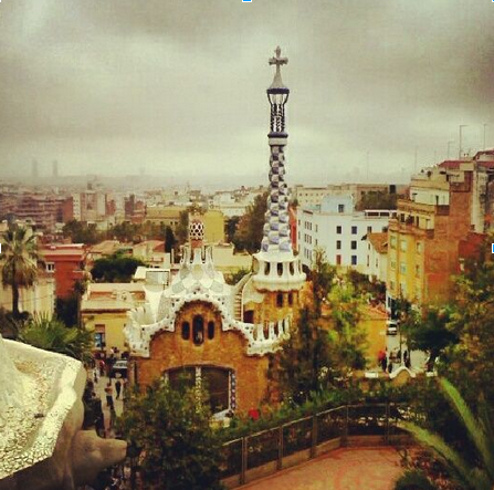
 A moody pic of Park Guell in Barcelona made cooler with Hudson.
Which Instagram Filter Works Best?
We’ve all been there. You’re scrolling through Instagram filters trying to decide what looks best on your photo of your cityscape view from the office. Lo-Fi? Hudson? They all look good! You settle on your first choice, add a witty caption, geo-tag it and voila! It’s published. Then the sinking feeling sets, in... you totally should have gone with Sutro! Here’s my guide to Instagram filters, helping you avoid that Insta-regret.
Each filter actually works best with certain types of photos, the trick is finding out which to use.
Amaro: Amaro’s increased exposure makes the colors a little harsher. It looks best with darker photos, and makes them look like they’ve aged out in the sun.
Rise: Rise adds a warm, golden glow to your snapshot so it’s perfect for making a beach look sunnier and your pale winter skin tanner.
Hudson: The icy cool tint is great for highlighting shadows. Use it on modern architecture to make buildings and cityscapes look sleek.
X-Pro II: High contrast and sharp edges make colors pop with X-Pro II. It looks good on a lot of different types of photos, so channel your inner Andy Warhol and make a dramatic collage.
Sierra: The name is the key to remembering this high exposure, low contrast filter. Sierra is made for landscapes and will wash out human skin tones.
Lo-Fi: Comparable to an auto-enhance tool, Lo-Fi makes photos more saturated and warmer. It’s best for making your food pics look mouth-watering good.
Early Bird: This sepia tone filter makes photos look like they’re straight out of an old time Western. Use it on landscapes and shots of your hipster friends.
Sutro: Perfect for punk groupies, Sutro essentially darkens the photo by burning the edges and dramatizing shadows and highlights. It makes any picture look Gothic and edgy.
Toaster: Like a sunspot on the middle of screen, Toaster adds a burnt, aged quality to photos. It’s best used when you want to highlight something or someone in the center of the frame.
Brannan: Brannan combines metallic tint, high exposure and contrast to give a shadowy-sepia tone to pictures. It adds drama to still-life portraits.
Inkwell: How is it that everyone looks better in black and white? If you’re totally stumped by all other options, this monochromatic filter is a safe choice.
Walden: Walden’s soft light and yellow tint has a way of making things look cuter. Use it on puppies, babies and anything else that makes you say “Awww!”
Hefe: Hefe is much like Lo-Fi but with a lower saturation. It helps enhance pictures with already vibrant colors like food or bright flowers.
Valencia: This subtle filter fades out color without washing it out completely. It looks good with stills like houses and buildings.
Nashville: Nashville’s warm, almost pinkish filter make you look at the world through rose-colored glasses. Use it on romantic pictures of you and your partner watching sunsets.
1977: Like the name suggests, this filter makes photos look like they’re in your parents’ photo albums from the 70s. It’s best used on close-ups of three-dimensional objects.
Kelvin: Kelvin’s warm temperature and high saturation can be hit or miss. It works best on photos with lots of light, giving it that late, summery feel.
Annie Johnson


Leave a comment