Call it Facebook's 10th Birthday Gift to Itself: Paper
To say that I have long hated the native Facebook app is a gross understatement. I've often said that it will be their lack of innovation in their mobile app that will be their downfall, and I still believe it's one of the main reasons why kids in the 13-25 year bracket turn away from it (that and the fact that their mom and grandmom are there). But with the just released Paper app (currently only available on iPhone), I may be eating crow and taking it all back for once. While this is not a replacement for the "official" Facebook app, you'll see soon 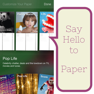 why they're calling it the Facebook App killer.
Paper is pretty impressive. If you're a fan of Flipboard, you're going to really, really like this new Facebook app. Its focus is on visually appealing images and news stories, so again, not a replacement for the current app.
Once you download the app, you're greeted with a brief tutorial that walks you through setting up the app:
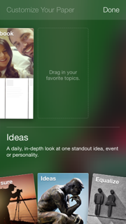
You get to choose what categories you want included in your dashboard. Food, news, lifestyle, technology, parenting—what matters to you is what you will drag into the dashboard of your paper. Side note —see that picture in the top? That's our friend, Stephanie Wonderlin Carls of TweetheartTV who just had a new baby boy last night, so a big CONGRATS to her!
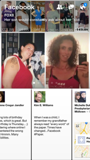
Now that you have selected your categories, this is what your "wall" looks like. You swipe to the left to scroll through the stories, and if one interests you, all you have to do is tap it to get it to full screen. Want to just keep reading status updates? Keep swiping. Come to a photo that you want to see? Tap again and a REALLY cool function is the tilt. You can tilt your phone from left to right to get a "panoramic" view of the photo!
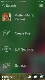
This is your admin panel where you can edit your options, manage your settings, etc.
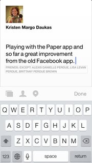 And this is your actual status update page.
I love the fact that you can segment your friends info from everything else. But there are definitely things that are lacking, and I am sure they will be fixed shortly. Here are a few of those:
- You can't tag someone in a post.
- Events are difficult to find.
- If you manage a page for your blog or business, you can't share a story to that page with Paper (note ... it's never been easy to share a story with a page on the mobile app.).
The other thing that I immediately noticed was the lack of Page posts in my feed. While that may be good for the normal Facebook user, it could be VERY challenging for businesses that use Facebook to engage with their customers. (Remember, I talked about big, beautiful images in my 2014 forecast :) .) If you haven't heard the warnings before, it's now a battle cry:
You MUST deliver great content and AMAZING images to get your message seen and heard.
I'm certain there will be a few updates to the app over the next few weeks, but other than the things that I've pointed out, I really like this app. I'll be using this as my primary Facebook app to see what changes are made and especially to see if I start seeing brands in the new stream.
This app could be a game changer for the end user as well as for the marketer—just not for the same reasons.


Leave a comment